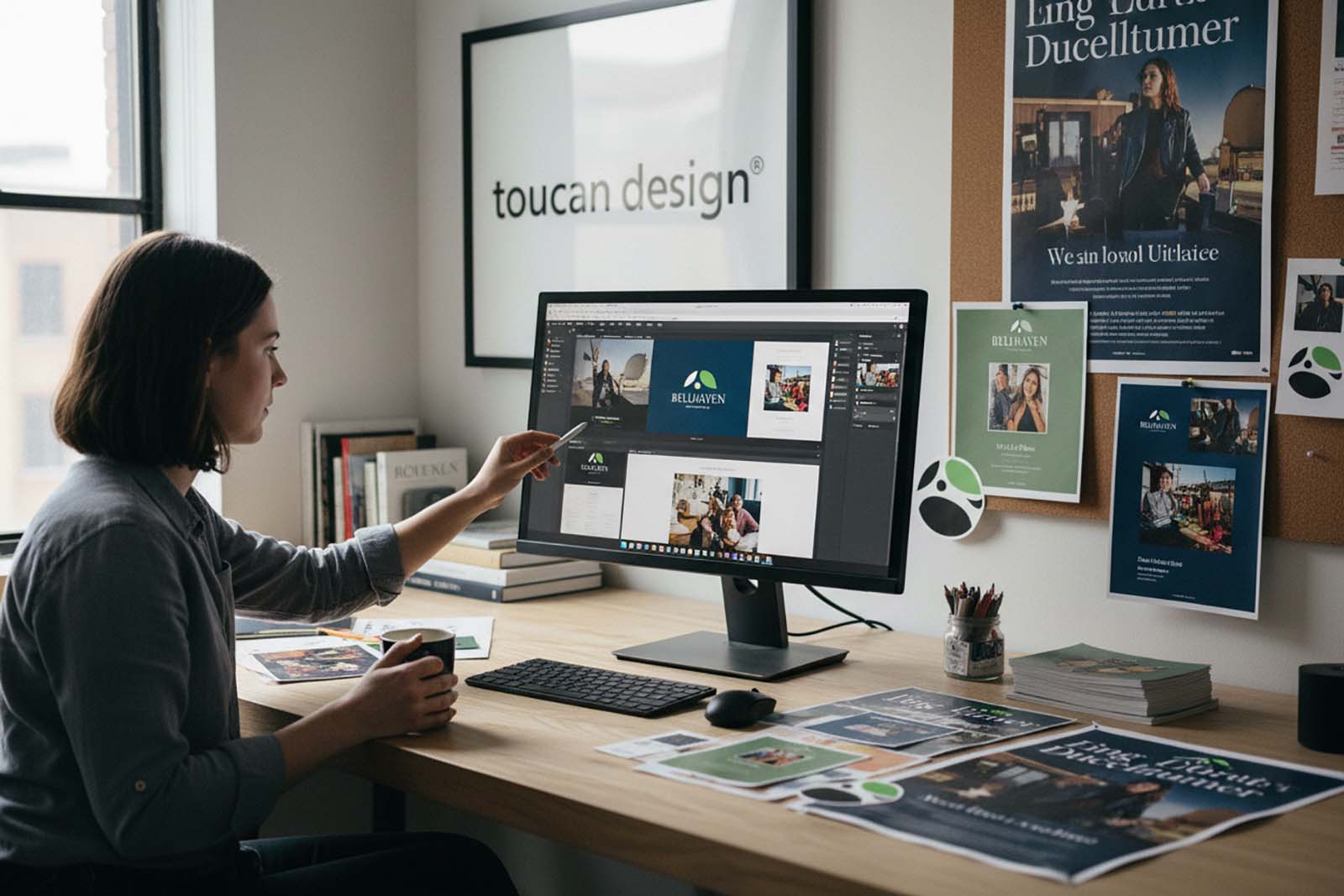
A logo rarely fails because it is ugly. More often, it fails because it cannot carry the weight of the brand around it. The most useful branding logo examples are not just memorable marks. They show how color, typography, shape, and application work together to support recognition in the real world – on websites, signage, packaging, vehicles, uniforms, social graphics, and print.
For businesses evaluating a new identity or refreshing an outdated one, that distinction matters. A logo should not be judged only on a presentation slide. It should be judged by how well it represents the organization across every customer touchpoint and how consistently it holds up over time.
What branding logo examples actually teach
When clients ask for examples, they are usually not looking for inspiration alone. They want to know what makes one logo system feel established and another feel temporary. Strong examples answer that by showing fit. The best logo for a law firm will not behave like the best logo for a restaurant, and a nonprofit may need a very different tone than a manufacturer or hospitality group.
That is why logo design is usually less about personal preference and more about strategic alignment. A distinctive logo can help build trust, but only if it reflects the business clearly and can be used consistently across branded materials, website design, digital marketing, and print. The Small Business Administration has long emphasized the value of clear brand presentation in building recognition and customer trust, and logo design is a central part of that foundation.
12 branding logo examples and why they work
1. Wordmark logos for professional credibility
A wordmark uses the business name as the logo. This approach works especially well for firms that need to project stability and clarity, such as legal, financial, consulting, architectural, and healthcare brands. The strength comes from typography, spacing, and restraint rather than visual complexity.
The advantage is immediate name recognition. The trade-off is that the typography has to do more work, so weak font choices can make the brand look generic very quickly. In these cases, custom or carefully selected letterforms matter.
2. Lettermark logos for long or formal business names
Organizations with long names often benefit from a monogram or lettermark. Universities, institutions, associations, and multi-word companies use this approach when initials are easier to remember than the full name.
A strong lettermark needs to feel deliberate, not like a placeholder. Proportion, line weight, and spacing become critical because the mark may appear small on digital platforms and large on signage. If the initials are common, a supporting brand system becomes even more important.
3. Symbol-based logos for instant recognition
A symbol or icon can be highly effective when the business needs a simple visual shorthand. This is common for companies with broad market visibility, product packaging needs, app icons, or strong social media usage.
The challenge is that symbol-only logos often take longer to build recognition unless the company already has significant visibility. For many small and mid-sized businesses, a symbol works best when paired with a wordmark rather than replacing it.
4. Combination marks for flexibility
A combination mark pairs a symbol with a business name. This is one of the most practical options because it allows the brand to use the full logo in formal settings and the icon alone when space is limited.
For many organizations, this is the most durable solution. It supports websites, social profile images, signage, merchandise, and print collateral without forcing the brand into a single rigid format. It also creates room for the identity to grow over time.
5. Emblem logos for tradition and authority
Emblems place the business name inside a badge, crest, seal, or contained shape. They are often used by schools, municipalities, clubs, heritage brands, breweries, and institutions that want an established feel.
Done well, an emblem can communicate trust and history. Done poorly, it can become too detailed to reproduce clearly at smaller sizes. That is where practical design decisions matter. A logo should still function on a mobile screen or in a one-color print application.
6. Minimal logos for modern brands
Some branding logo examples succeed because they remove anything unnecessary. Minimal logos rely on clean geometry, careful spacing, and a focused color palette. They can feel current without looking trendy if they are built on solid fundamentals.
This style works well for technology-adjacent businesses, wellness brands, real estate groups, and service companies that want a polished, contemporary presence. The risk is sameness. Minimal does not automatically mean distinctive.
7. Typography-led logos with personality
Not every business needs an icon. In many cases, typography can carry the entire brand personality. Serif fonts can suggest tradition and authority, while sans serif systems often feel modern and direct. Script or hand-drawn elements can add warmth, but they need to remain readable.
The right choice depends on the audience and the context. A boutique hospitality brand may benefit from more character, while a B2B service company may need a cleaner, more disciplined look.
8. Color-driven logos that build recall
Some logos are remembered less for their shape than for their consistent use of color. This can be a powerful branding asset if the palette is applied consistently across print, web, advertising, and environmental design.
Color should never carry the full burden, though. A logo still needs to work in black and white, grayscale, and limited production settings. Accessibility also matters. Contrast and legibility affect how clearly a brand is experienced online, and guidance from the Web Content Accessibility Guidelines is useful when evaluating those choices.
9. Industry-specific logos that avoid clichés
Many industries fall into visual habits. Construction firms often use roofs and tools. Healthcare brands default to crosses and leaves. Restaurants reach for forks, flames, and chef hats. Real estate brands lean on skylines and houses.
The problem is not that these symbols are always wrong. The problem is that they are often interchangeable. Strong branding finds a way to acknowledge the category without disappearing into it. That may mean simplifying the symbol, focusing on typography, or building a more distinctive overall visual system.
10. Logos designed for digital-first use
A logo that looked acceptable in print fifteen years ago may struggle in digital environments now. Website headers, mobile screens, favicons, social avatars, and responsive layouts all demand flexibility.
That is why modern logo development should consider digital application from the beginning. WordPress site builds, for example, often need several logo variations for header layouts, mobile menus, and retina displays. If the identity is too intricate, it can lose impact quickly.
11. Logos that extend into a full brand system
A logo is not the whole brand. Some of the best examples work because they are supported by strong secondary colors, type standards, image direction, iconography, and layout rules. Without those elements, even a well-designed logo can feel isolated.
This is often where businesses see the difference between a freelance one-off logo and a more complete branding process. The logo becomes more valuable when it is part of a coordinated identity that carries through web design, brochures, signage, presentations, ads, and social media graphics. For businesses planning a broader rollout, that connection between brand identity, website design, print design, and SEO content matters more than the logo alone.
12. Logos built for long-term use, not short-term taste
Some logos impress at first glance but age badly because they are tied too closely to a design trend. Others feel a little understated at launch and end up lasting much longer because they are grounded in clarity and relevance.
That is often the better business decision. Rebranding is expensive. A logo should leave room for growth, new services, updated marketing, and changes in audience without requiring a full reinvention every few years.
How to evaluate branding logo examples for your own business
The right question is not, “Do we like this?” It is, “Would this still represent us well across every place our customers encounter us?” That includes your website, business cards, trade show materials, sales sheets, social channels, uniforms, presentations, and signage.
It also helps to ask whether the logo matches the maturity of the organization. A startup may need energy and clarity. An established company may need credibility and refinement. A nonprofit may need warmth and trust. A manufacturer may need precision and strength. Good branding reflects those differences.
If you are reviewing examples as part of a rebrand, look beyond the hero image. Ask to see logo variations, one-color versions, horizontal and stacked formats, font choices, and examples of real-world application. The American Institute of Graphic Arts has long promoted standards-based design thinking for exactly this reason: identity design should perform, not just decorate.
Where logo design fits in the larger brand picture
A business does not gain credibility from a logo alone. It gains credibility when the logo is supported by a professional website, consistent messaging, strong print materials, and marketing assets that all look like they belong to the same organization.
That is why logo work is often most effective when approached as part of a larger branding and communications system. If your website looks unrelated to your printed materials, or your social graphics use different colors and fonts than your signage, the brand starts to feel fragmented. Consistency is what makes the logo carry more weight.
For that reason, many organizations benefit from treating logo design as the starting point rather than the finish line. A well-built identity should make future decisions easier, from a brochure redesign to a WordPress website refresh to advertising creative and ongoing content production.
The most useful logo example is not the one that gets the fastest reaction in a meeting. It is the one that still looks right a year later, still works in every format you need, and still helps your business appear clear, established, and trustworthy wherever customers find you.