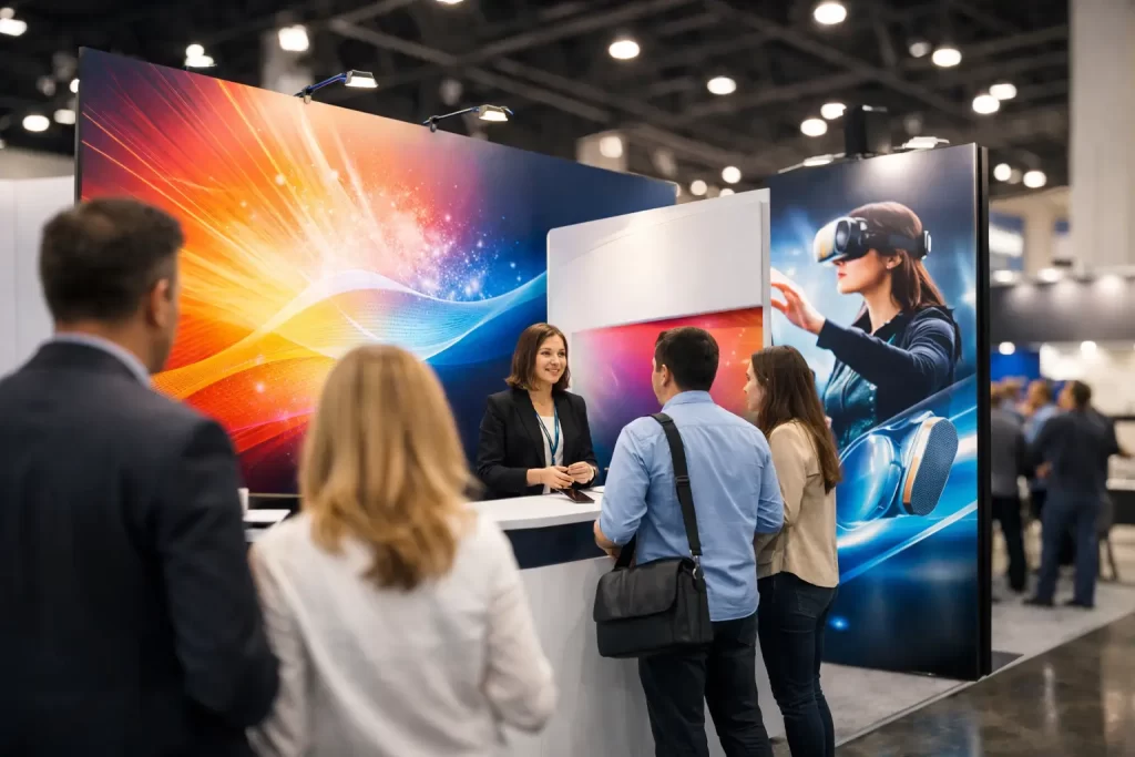
A crowded expo hall gives you a few seconds to make an impression. That is why trade show booth graphics matter so much. Before a visitor reads a brochure, scans a badge, or starts a conversation, they are already judging your business by what they see from the aisle.
Good booth graphics do more than fill wall space. They help people understand who you are, what you offer, and whether your company feels established, relevant, and worth their time. Poor graphics do the opposite. They create confusion, blend into the background, or make a strong business look less polished than it really is.
What trade show booth graphics need to accomplish
The strongest booth graphics work at three distances. From across the aisle, they need to catch attention. From a few feet away, they need to communicate what your company does. Once someone steps into the booth, they should support a sales conversation rather than compete with it.
That sounds simple, but it is where many exhibits break down. Businesses often try to put too much information into the design. They treat a backdrop like a flyer, adding paragraphs, product lists, and small logos that no one can read. On a trade show floor, less usually performs better.
Clarity matters more than cleverness. A bold message, readable type, strong brand colors, and a professional layout usually outperform crowded graphics with too many competing ideas. If attendees need to stop and decode your message, you have probably already lost them.
Start with the goal, not the artwork
The right creative direction depends on the purpose of the event. A company introducing a new product may need booth graphics centered on one launch message. A professional services firm may need to build credibility and explain its core value quickly. A manufacturer may want to highlight capabilities, certifications, or industries served. The graphics should reflect that priority.
This is where strategy matters. A booth is one piece of a larger brand system, not a standalone design project. If your company has inconsistent messaging across signage, brochures, sales sheets, presentation decks, and your website, the exhibit can feel disconnected. A visitor may remember seeing you but still leave unsure about what you actually do.
For many organizations, trade shows work best when booth graphics are coordinated with supporting materials such as printed handouts, branded displays, sales collateral, presentation screens, and follow-up landing pages. That kind of consistency helps build trust and makes your marketing more usable after the event.
The most effective booth graphics are usually the simplest
Simple does not mean plain. It means focused.
A strong exhibit graphic typically includes one clear headline, concise supporting language, a limited number of visual elements, and a design hierarchy that guides the eye naturally. Your logo should be visible, but it does not need to dominate every inch of space. Your audience is more interested in what you can do for them than in seeing an oversized logo repeated five times.
Photography and illustrations should also earn their place. Generic stock imagery rarely helps. If the image could belong to any company in any industry, it is probably not doing much for your brand. Custom product photography, real project imagery, or industry-specific visuals tend to feel more credible.
There is also a practical side to visual simplicity. Trade show booth graphics are viewed in motion, often from awkward angles, under inconsistent lighting, and in a room full of competing noise. High contrast, readable fonts, and a restrained color palette usually hold up better than intricate layouts with too many subtle details.
Common mistakes that weaken booth performance
One of the most common problems is designing for close-up viewing only. Teams approve artwork while looking at a full-size screen in a quiet office, but the trade show environment is not quiet and no one is standing still. Text that seems readable on a monitor can become useless from ten feet away.
Another issue is trying to say everything at once. Businesses often feel pressure to include every service, every market, every differentiator, and every certification. The result is a graphic that says nothing clearly. It is better to create one strong message that invites conversation than six weaker messages fighting for attention.
Production mistakes can also cause trouble. Low-resolution images, poor color matching, incorrect bleed setup, and rushed file preparation can turn a strong design into a disappointing printed result. Trade show materials are large-format assets, and they need to be built correctly from the start.
Then there is the branding issue. If your booth graphics do not match your website, printed materials, and sales presentation, attendees may sense inconsistency even if they cannot name it. Brand trust often comes from repetition and alignment. A cohesive identity carries more weight than isolated creative pieces.
How booth design supports sales conversations
The best booth graphics help your staff do their job. They give visitors an easy opening. A concise headline can answer the first question before it is asked. A product image can quickly orient someone to what you sell. A well-placed supporting panel can reinforce technical credibility while the conversation moves forward.
This is especially useful for businesses with longer sales cycles or more complex offerings. If your team spends the first two minutes of every conversation explaining the basics, your graphics are not working hard enough. Effective design shortens that ramp-up time.
There is a balance, though. Graphics should support interaction, not replace it. If the display looks like a wall of information, people may read instead of engage, or skip the booth because it feels like too much effort. The design should invite contact, not create homework.
Trade show booth graphics should fit the exhibit itself
Not every booth needs the same graphic approach. A pop-up display, modular system, tabletop setup, island exhibit, and branded backdrop all have different viewing conditions and production needs. The messaging that works on a ten-foot back wall may not work on a narrow side panel or retractable banner.
This is why templated solutions can fall short. A design needs to account for booth architecture, traffic flow, sightlines, lighting, and how attendees move through the space. Even excellent branding can underperform if it is applied without considering the physical environment.
It also helps to think beyond the main wall. Counter wraps, literature displays, hanging signs, floor graphics, monitor screens, handouts, and branded giveaways can all contribute to a more unified experience when they are intentionally designed. When these elements feel disconnected, the booth can look assembled rather than planned.
Why this work often connects to larger marketing needs
Trade shows rarely operate in isolation. A prospect may first notice you at an event, then visit your website, review a leave-behind, and talk with your team weeks later. If those touchpoints do not align, momentum gets lost.
That is why many businesses benefit from treating booth graphics as part of a broader communication system. Brand identity, print design, sales materials, presentation support, landing pages, and search visibility all shape what happens after the event. If the booth creates interest but your website does not reinforce the same message, the opportunity weakens.
For companies that attend multiple events each year, this is even more important. Reusable graphic systems, coordinated messaging, and professionally produced print materials can make future shows easier to manage while keeping the brand presentation consistent. Businesses looking to strengthen that continuity often pair exhibit design with broader branding, print design, website design, and SEO content support so the message holds together across channels.
What to plan before design begins
Before artwork starts, it helps to answer a few practical questions. Who are you trying to attract at the event? What is the single most important message they should remember? Which products or services matter most here? What action should a visitor take next?
It is also worth confirming the production specs early. Every display system has different dimensions, file requirements, safe zones, and material options. Planning around the actual exhibit hardware avoids expensive revisions later.
And if multiple teams are involved, marketing, sales, leadership, and event staff should align on the purpose of the booth before anyone starts reviewing creative. That usually leads to stronger decisions and fewer rounds of trying to make one display serve conflicting goals.
Businesses that want a more polished result often work with a creative partner who can connect exhibit graphics with the rest of the brand. That is especially helpful when booth design needs to coordinate with brochures, sell sheets, signage, digital assets, or website updates tied to the event.
Trade show floors are busy, competitive spaces. The companies that stand out are not always the loudest. They are usually the clearest. If your booth graphics make your business easy to understand, easy to trust, and easy to approach, they are doing exactly what they should.