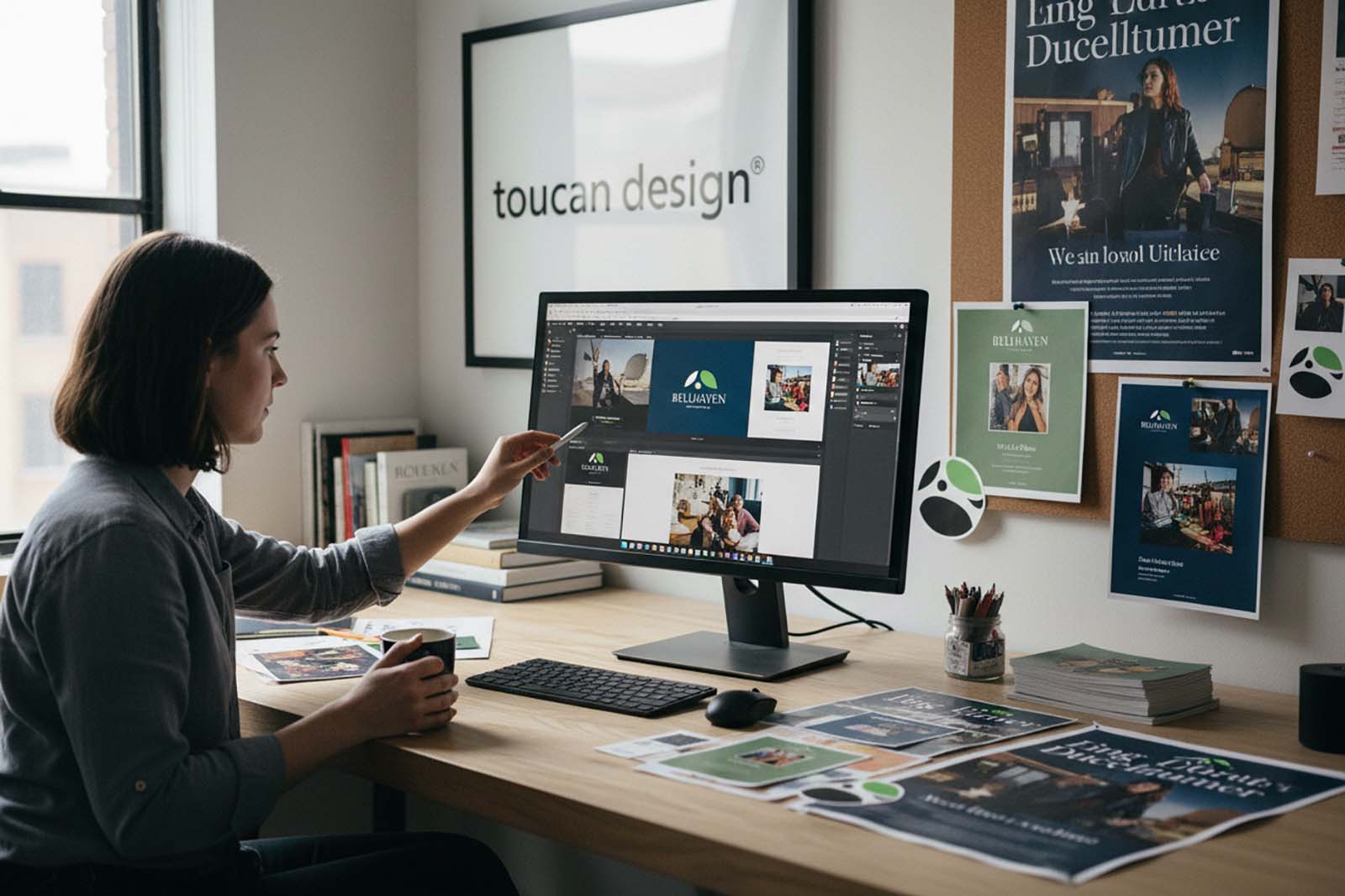
A website can receive steady traffic and still fail to produce enough inquiries, calls, appointments, or sales. The gap is usually not one dramatic problem. It is a series of small points of friction: unclear messaging, hard-to-find contact options, slow pages, weak proof, or a next step that asks too much too soon. Learning how to improve website conversions starts with looking at the site through a prospective customer’s eyes.
For most businesses, a conversion is not limited to an online purchase. It may be a completed contact form, a quote request, a phone call, a scheduled consultation, a newsletter signup, or a visit to a location. The right improvements depend on the action that matters most to your business and the expectations of the people you serve.
Start With One Clear Conversion Goal
A page cannot effectively ask visitors to do everything at once. When a service page gives equal emphasis to calling, downloading a brochure, viewing a gallery, following social media, subscribing, and requesting a quote, the visitor may do none of them.
Choose the primary action for each key page. A manufacturer may want qualified quote requests. A restaurant may prioritize reservations or online ordering. A professional service firm may need consultation requests. Supporting actions can remain available, but the page should make its main purpose obvious.
This also makes performance easier to evaluate. Instead of asking whether a redesign “worked,” you can look at whether the right actions increased and whether the inquiries are better qualified. A higher volume of poor-fit leads is not necessarily a conversion win.
How to Improve Website Conversions With Clearer Messaging
Visitors should be able to answer three questions quickly: What does this business offer? Who is it for? Why should I consider it? If the opening copy relies on broad phrases such as “quality solutions” or “exceptional service,” it leaves too much work for the reader.
Lead with a direct description of the service or offer, then support it with meaningful detail. A healthcare practice might explain the type of care offered and what a new patient can expect. A commercial contractor might identify the project types it handles, the markets it serves, and its approach to scheduling and coordination. Specific language gives prospects a reason to continue.
Strong messaging should also match the source of the visit. Someone arriving from a search for a particular service needs confirmation that they are in the right place. Someone coming from an ad or print campaign should see the same core promise they saw before clicking. Consistent branding, copy, photography, and calls to action make the experience feel considered rather than disconnected.
Make the Next Step Easy to Find
A call to action should be visible, plainspoken, and appropriate to the decision being made. “Request a Consultation,” “Get a Project Quote,” “Schedule an Appointment,” and “Call Our Team” are clearer than vague labels such as “Learn More” when a visitor is ready to act.
Place the primary call to action near the top of the page and repeat it naturally after important sections. This is especially useful on longer service pages, where a visitor may decide to contact you only after reading about process, capabilities, or results. Repetition is helpful when it serves the reader, not when it interrupts the page.
The action itself should feel proportionate. A person researching a high-value service may be willing to request a consultation but not complete a 15-question form. Keep initial forms focused on the information needed to begin a conversation. You can gather additional details after the prospect has expressed interest.
Build Trust Before Asking for Contact Information
Most visitors are assessing risk. They want to know whether your business is established, capable, responsive, and suited to their needs. Professional design helps, but it needs to be supported by evidence.
Use real proof wherever possible: client testimonials, project examples, certifications, years of experience, recognizable industries served, team credentials, and a clear explanation of your process. A well-organized portfolio can be especially persuasive for businesses selling creative, technical, or custom services because it shows the standard of work rather than simply describing it.
Trust signals should be relevant to the page. A testimonial about responsive website support belongs near web services. A case example involving packaging or print materials belongs near related services. Generic praise has value, but specific comments about results, communication, or reliability are more credible.
Be careful not to overwhelm the page with badges, logos, and claims. Too many competing proof points can create visual noise. Select the evidence most likely to reassure the particular visitor you are trying to reach.
Remove Friction From Design and Content
Conversion-focused design is not about making every page look aggressive or sales-heavy. It is about helping people locate information and take action without unnecessary effort. Clear navigation, readable type, helpful headings, logical page sections, and enough contrast between text and background all contribute to that experience.
Mobile deserves particular attention. Many visitors will first encounter your business from a phone, often while comparing several options. Buttons should be easy to tap, contact details should be visible, forms should be manageable, and important information should not be buried in oversized visual elements. A page that looks polished on a desktop but feels cumbersome on a phone will lose opportunities.
Page speed matters as well. Large uncompressed images, excessive scripts, outdated plugins, and poorly managed hosting can delay a visitor before they have even seen the offer. The solution is not always to remove visual content. For design-driven brands, imagery can be essential. The goal is to use it intentionally and optimize it so it supports, rather than slows, the experience.
Accessibility improvements often help conversions too. Clear labels, descriptive buttons, readable contrast, and straightforward page structure make a website easier to use for more people. They also make information easier to scan for busy visitors who simply want an answer quickly.
Give Service Pages the Depth Buyers Need
Thin service pages rarely convert well because they force prospects to seek answers elsewhere. A useful page explains what is included, who the service is intended for, what the engagement process looks like, and how to begin. It should anticipate the practical questions a buyer has before making contact.
The appropriate amount of detail depends on the purchase. A simple retail or hospitality offer may need concise information and a fast path to action. Branding, web development, institutional communications, or other considered services usually require more context. In those cases, process descriptions, examples, timelines at a high level, and commonly asked questions can reduce uncertainty.
For businesses that rely on several marketing channels, the website should connect the work. Brand identity, print materials, advertising, social media, search visibility, and website content should present a consistent picture. Toucan Design approaches these pieces as part of a broader business presence, helping organizations avoid the mixed messages that can weaken buyer confidence.
Test Changes Instead of Relying on Assumptions
Even experienced teams can misjudge what motivates a particular audience. A cleaner form may improve completion rates, but it could also reduce lead quality if it removes a useful qualifying question. A shorter page may create more inquiries, while a detailed page may generate fewer but better-prepared prospects. Context matters.
Start by reviewing where visitors leave, which pages attract the most traffic, how people reach the site, and which calls to action receive attention. Then make one meaningful change at a time. You might revise a headline, move a call button, simplify a form, add a project example, or improve the mobile layout. Give the change enough time and traffic to produce useful information before drawing conclusions.
Speak with the people who answer calls and respond to forms. They can often identify a conversion problem that analytics cannot show, such as visitors misunderstanding a service, expecting something you do not offer, or struggling to find pricing guidance. Sales and customer service feedback belongs in the website improvement process.
Treat Conversion Improvement as Ongoing Maintenance
A website is not finished when it launches. Services change, customer questions evolve, and older content can quietly become less useful. Regular reviews keep core pages current and allow you to improve the areas that have the greatest business impact.
The most effective conversion work is usually practical rather than dramatic: a more specific headline, a better project example, a faster mobile page, or a form that respects the visitor’s time. When each part of the site makes the next decision easier, more of the right visitors will be ready to start a conversation.